Rice Apps Logo Design
And other interaction designs
Project Overview
Rice Apps is a student-run web development organization which builds apps for the Rice University community.
My Contributions
I designed various logos for Rice app projects and redesigned the Friends of Texas WildLife website (will launch in 2020). The following is an example of my logo design process.
First Iteration
Inspired by Rice University’s mascot owl, I used the owl to represent Rice or the “a” of “apps”.
Feedback from the club founder: I want Rice Apps to be an independent organization, not so much associated with the rice university’s owl. Also preferably, the logo color should use light pink and green, as you found on our website.
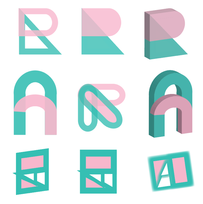
Second Iteration
I played with the R and A characters, some basic geometric shapes and lines in pink and green.
Feedback from the club founder: I prefer a more simplistic, one-stroke style.
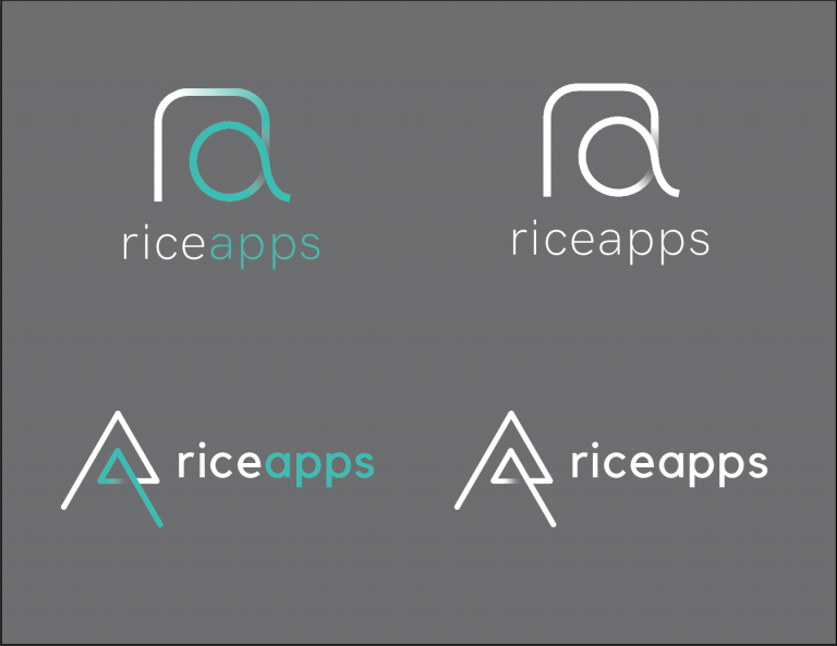
Third Iteration
We came up with two ideas: a more circular one and a more triangular one of the RA monogram. Because I like the circular design more, I also tested it with different colors
We casted a ballot to ask the 48 members at Rice Apps to vote for the logo they preferred, and the circular design got 79.1% support rate.
Third Iteration
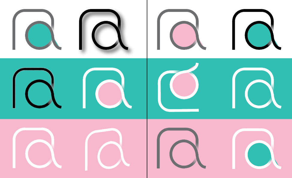
Circular Design with Colors
Final Version
The final version of the logo are used on Rice Apps website, the apps they developed, and other swags they offered.
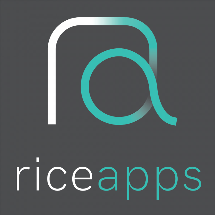
For Light Background
For Dark Background.
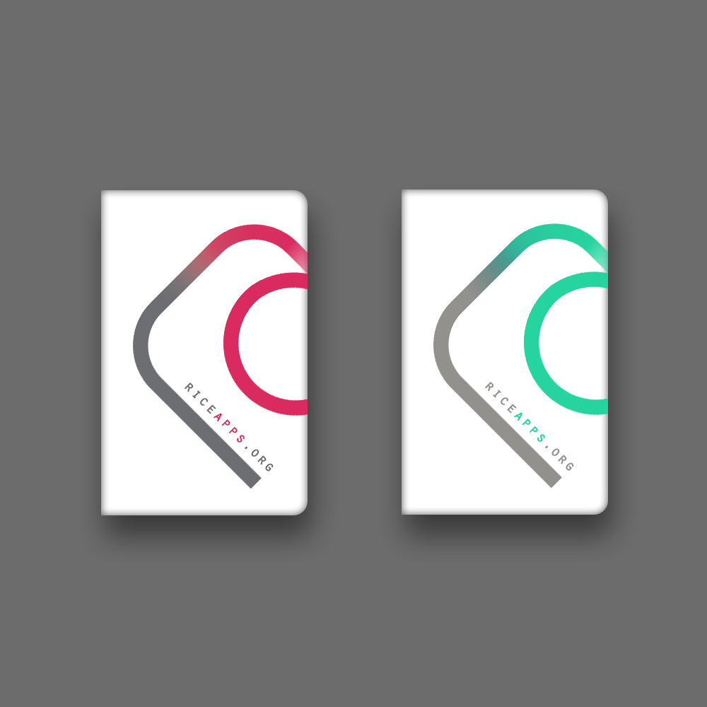
Notebook
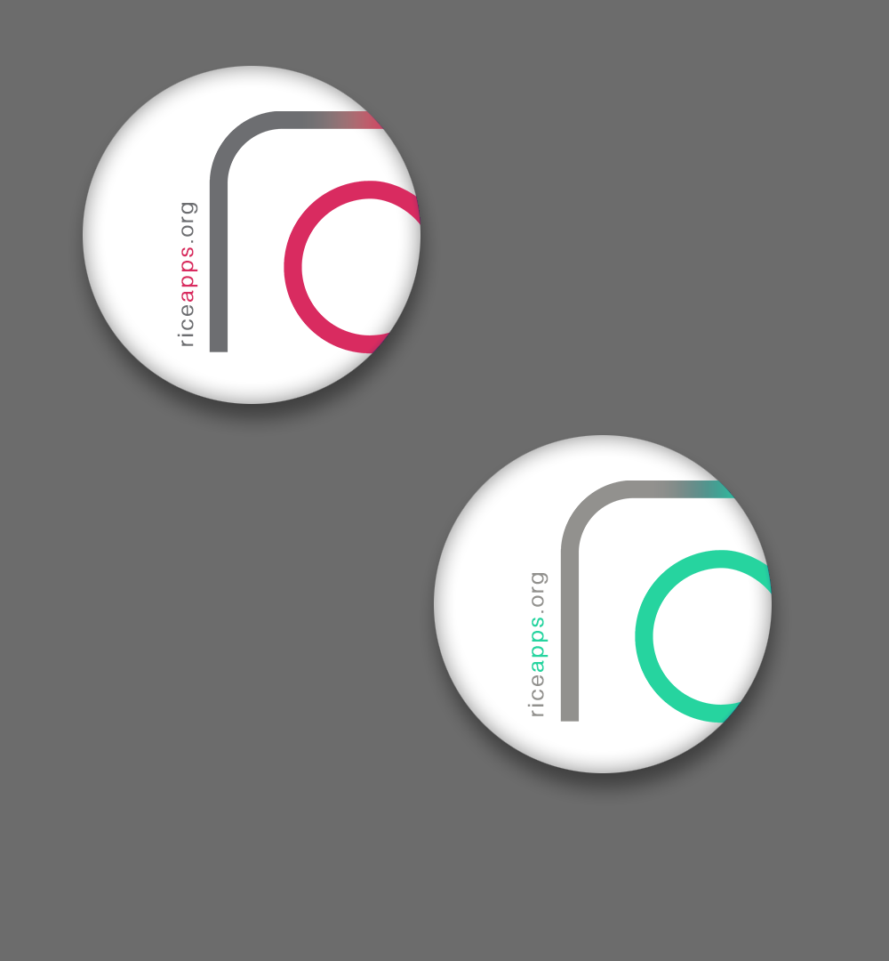
Sticker
Audi News
Interface Design
Project Overview
On the first day of my UX design internship, I was asked to create a low-fidelity prototype for the home page of the Audi app to increase the brand loyalty and satisfaction of their car owners.
Specifically, the Audi official account on Wechat received many followers because of its great news content, so they want to add this news feature to their app without interupting the current user flow too much.
My Workflow
I looked through the Audi app and Audi Wechat account to better understand the user flow and proposed a potentially better information architecture. Then I analyzed multiple popular car owner apps and news apps in terms of their features and visual design.
Afterwards, I sketched multiple versions of the home page on paper to discuss with my team. Eventually, we picked the following four ideas:
Ideas approved by my manager
1. Card style after original home page - this is the most conventional idea, just putting the news feature after the original page
2. Top news with tab style after original home page - this is a popular style among news app while keeping the original home page. The concern is that Audi may not have that many articles under each tab.
3. Independent news page to replace part of the original home page - this idea removes some of the repetitive features and give more focus to the news
4. Independent news page with more features - this idea is based on my competitor analaysis where I found many care owner apps have a community feature where people can discuss questions about the cars or road trips together
Results
The following are the low-fidelity prototypes of my four ideas. Our client picked the first idea (most conventional one) because they want to minimize the changes to their old users. Afterwards, our visual design team worked on creating high-fidelity prototypes.
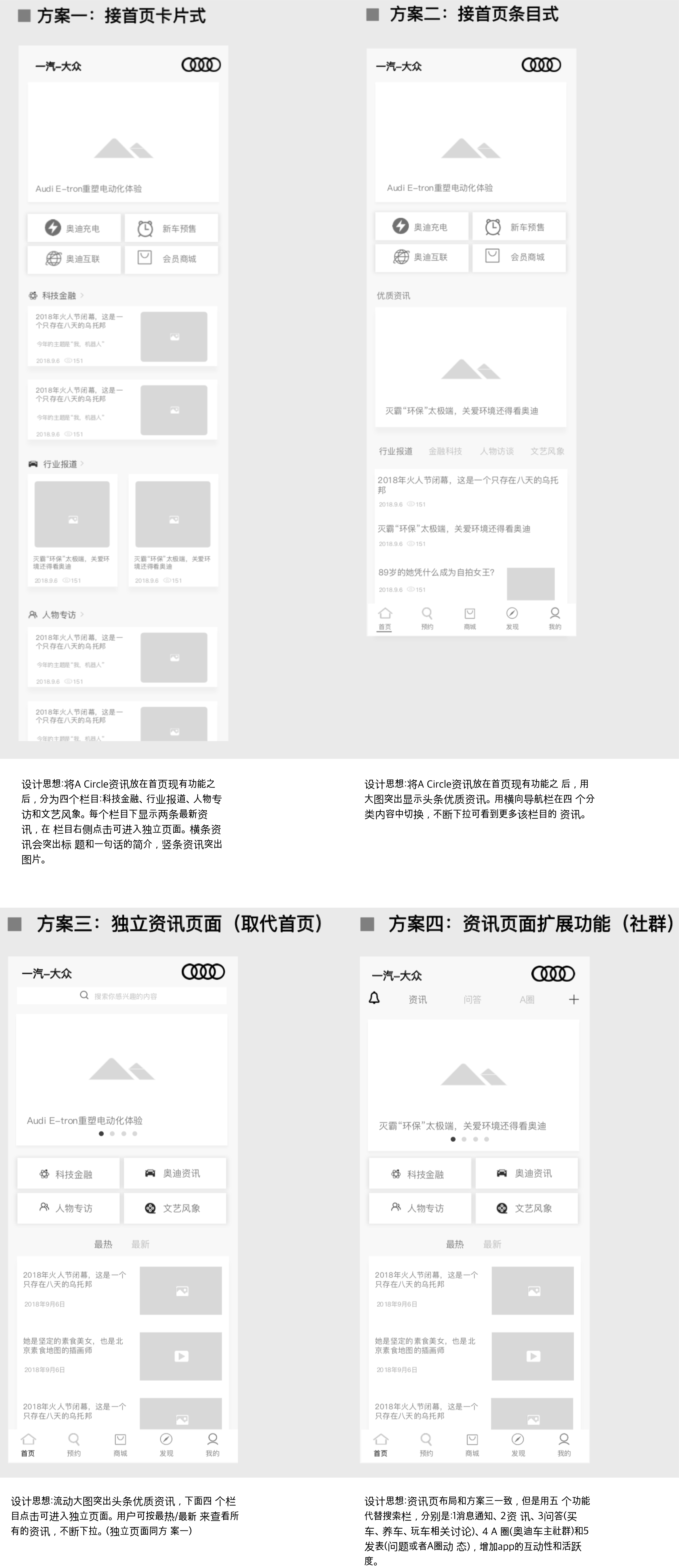
Four design ideas with thoughts at the bottom
China Aviation Weather
Interaction Design
Project Overview
China Aviation Weather is aimed to provide accurate, continuous and real-time weather forecast and warnings to pilots, airports and other stakeholders to improve the safety and efficiency of flights.
For this project, they asked us to redesign their website, ipad and mobile apps to make it more user friendly and visually appealing.
My Workflow
I analyzed the original website and apps along with their 317-page website handbook and created a high-level summary of the 25 features. Then I cooperated with two interaction designers to finish the first version of redesign in three weeks, where I worked on all three versions (website, app and iPad app)
After our boss approved our draft, we arranged a meeting with our client. While a few feature still need more information from our client to decide the best flow, the majority of them are approved and sent to the visual design team to work on. We expect to publish the website and app in late 2020.
Some of my work
Due to confidentiality concerns, I only listed the summary of features and overview of mobile app interfaces as part of my work here.
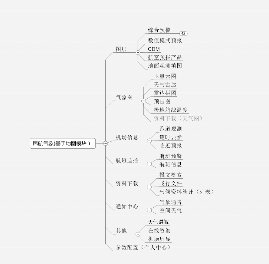
high-level summary of features
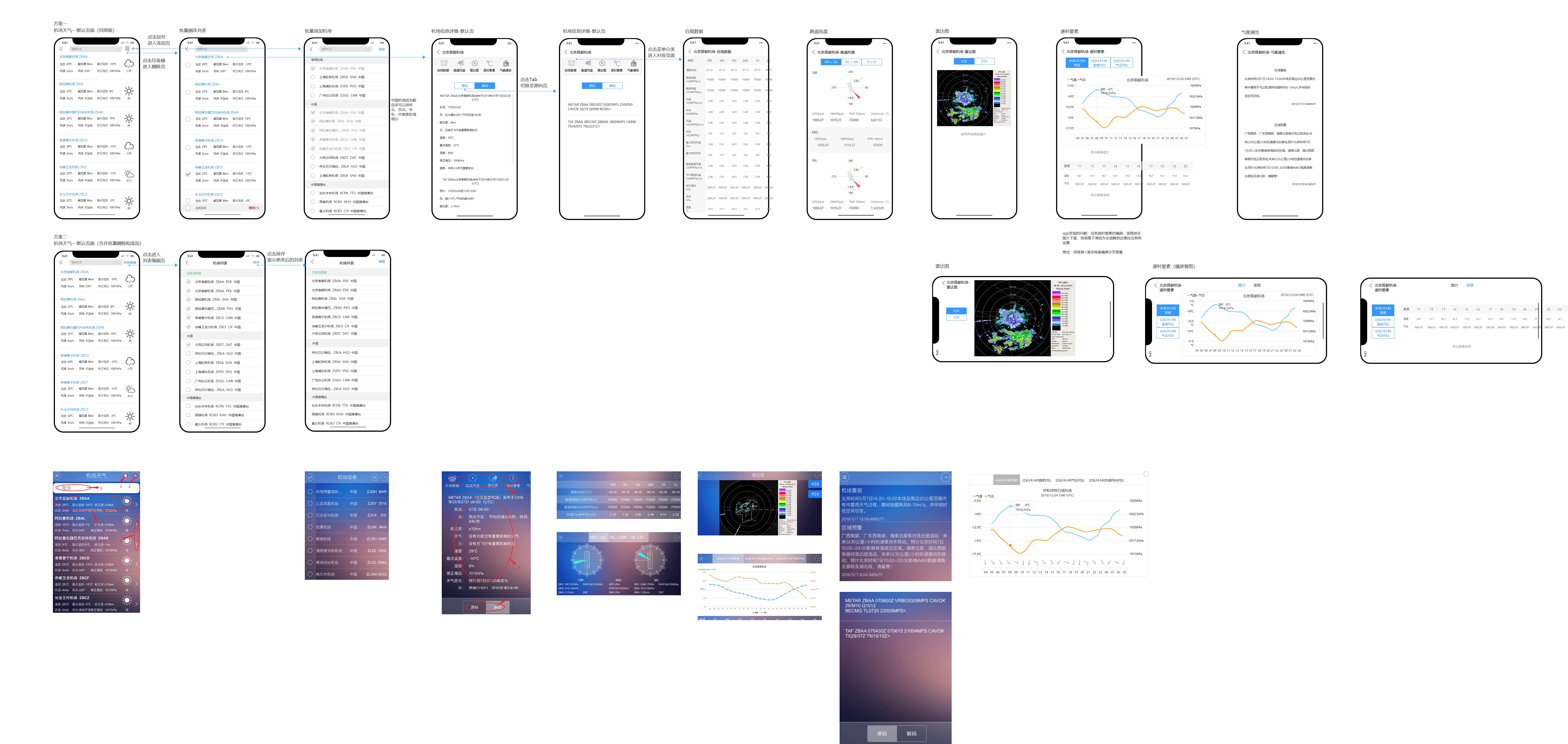
overview of my mobile app design, with original interfaces on the bottom