The Georgia Aquarium, home to over 100,000 animals, offers engaging and exciting guest experiences that inspire the awareness and preservation of aquatic animals worldwide. In 2018, around 2.5 million guests visited the aquarium, and summer visitor attendance reached record breaking numbers.
The client has projected that the numbers are going to continue to increase, which will add stress to the exhibit and gallery spaces as well as the dining areas.
Therefore, the design space of this project is exploring the possible solutions to alleviate overcrowding issues faced in Café Aquaria. This topic space can be broken down to the following central ideas:
This is the final prototype we designed for the problem. See below for the story of how we made it.
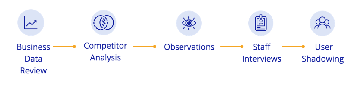
We conducted the following research to better understand the aquarium's current situation and user attributes.
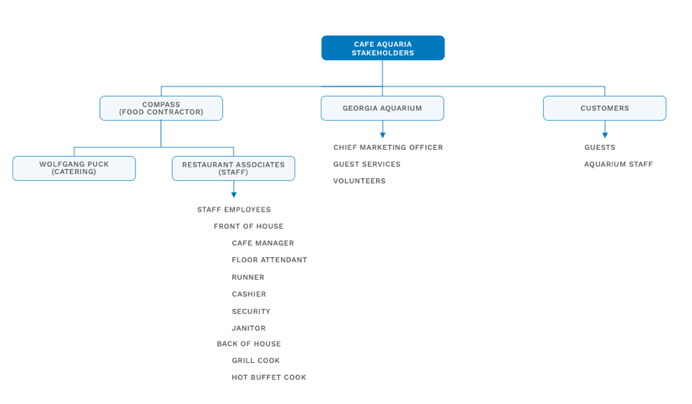
A list of stakeholders involved in the aquarium domain space was organized into categories and can be found in the chart below. This chart was built from our stakeholder interviews and observations.
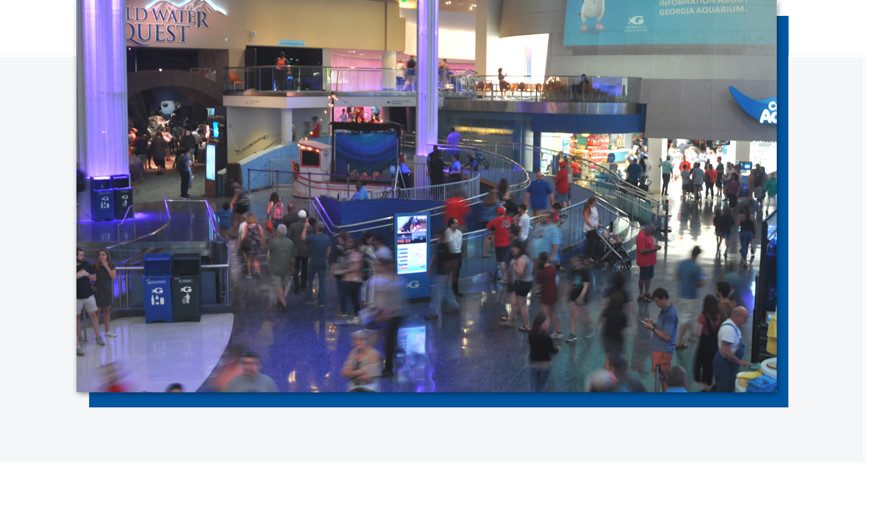
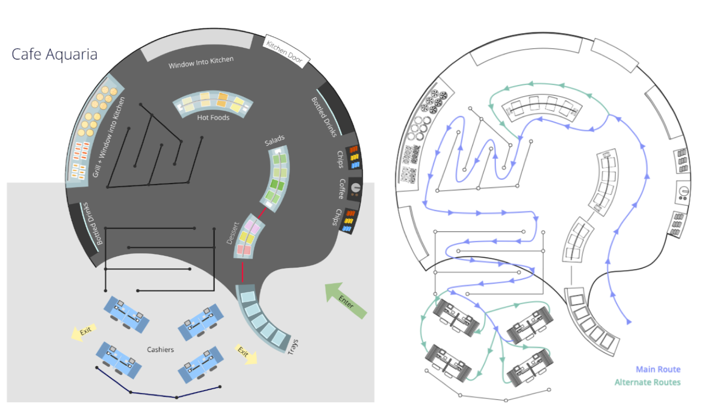
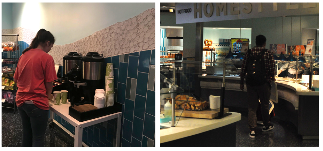
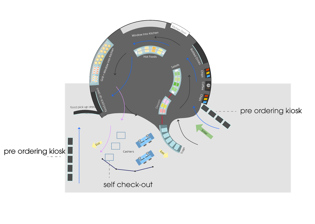
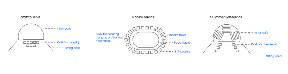
When visiting the aquarium, each of us sketched the cafe layout in order to better understand the traffic flow. The digitized layout and flow of traffic can be seen below. By mapping the current spatial organization and the crowd trends we can better understand how the overall customer experience is affected.
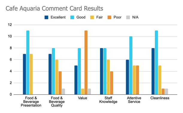
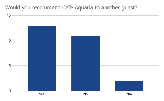
We were also able to obtain comment cards from the cafe which gave us some additional data from the customer themselves. However, we want to point out that the sample is relatively small (23 respondents), and we do not know the exact dates of when these comment cards were filled out. The comment cards were paper-based so we transcribed and analyzed the data ourselves. We can see that customers are unsatisfied with the pricing the most, then the services and information provided by the staff.
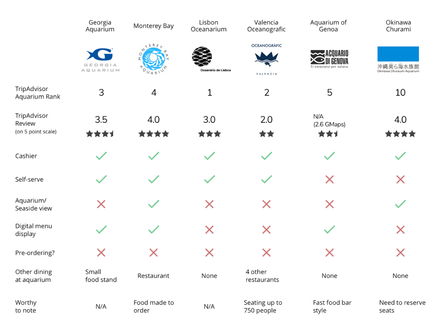
We went on the websites of the top 5 aquariums in the world ranked by Trip TripAdvisor to look up the cafes to see their menus, environment, and what they had to offer. Furthermore, we also looked up the TripAdvisor and Google Map photos, ratings, reviews of the cafes within each aquarium.
For the competitor analysis, we set up a cafe features matrix listing items that we thought were important in having an effect on the cafe experience, as well as features that some cafes had in common and filled in the table accordingly. The table can be found below:
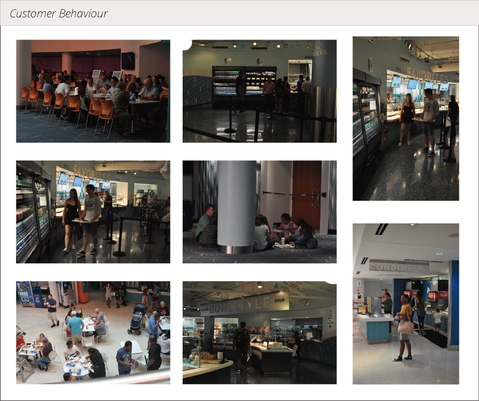
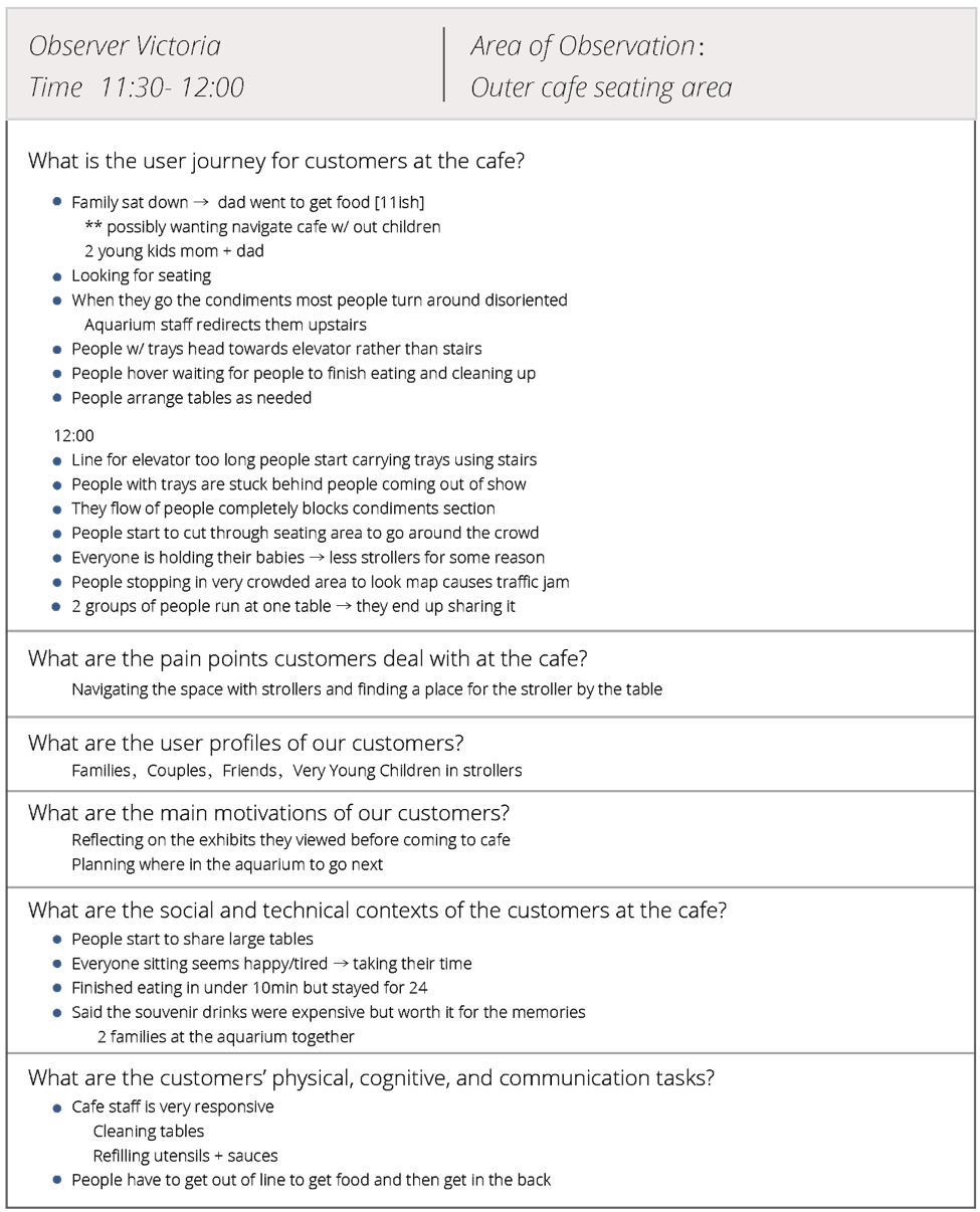
As we split into groups to observe different areas concerning different dining stages, we could get a comprehensive picture of user journey. An example of our observation table is shown below:
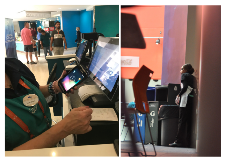
We interviewed 1 manager, 3 cashiers, 1 floor attendent supervisor and 1 floor attendent, and developed better understanding of the schedule, training, team dynamic, current technology, emotions, top concerns of the staff. They also made comments about the top concerns of the customers: first the pricing, second the seating.
The most noticeable point for our design is the lack of trust: customers don't trust the cashier, so they sometimes ask the cashier to reweigh their food to check the price; sometimes they'll toss the food or putting it back when finding the price too high, creating more food waste.
To understand customers' decision-making process and pain points, we shadowed 7 families ordering and table-finding process, and interviewed them about their experiences afterwards.
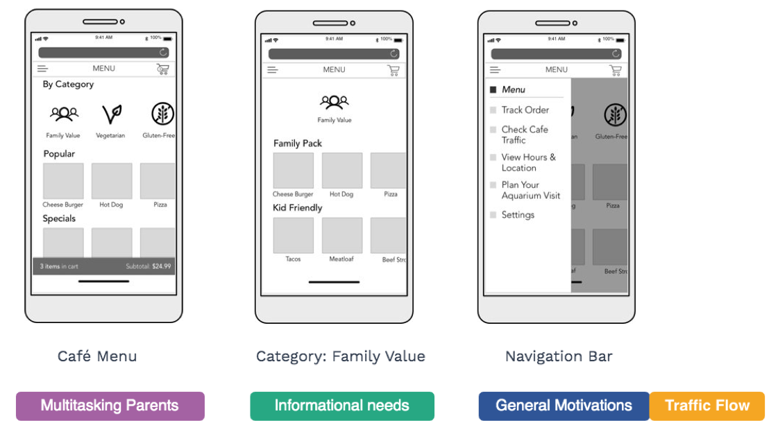
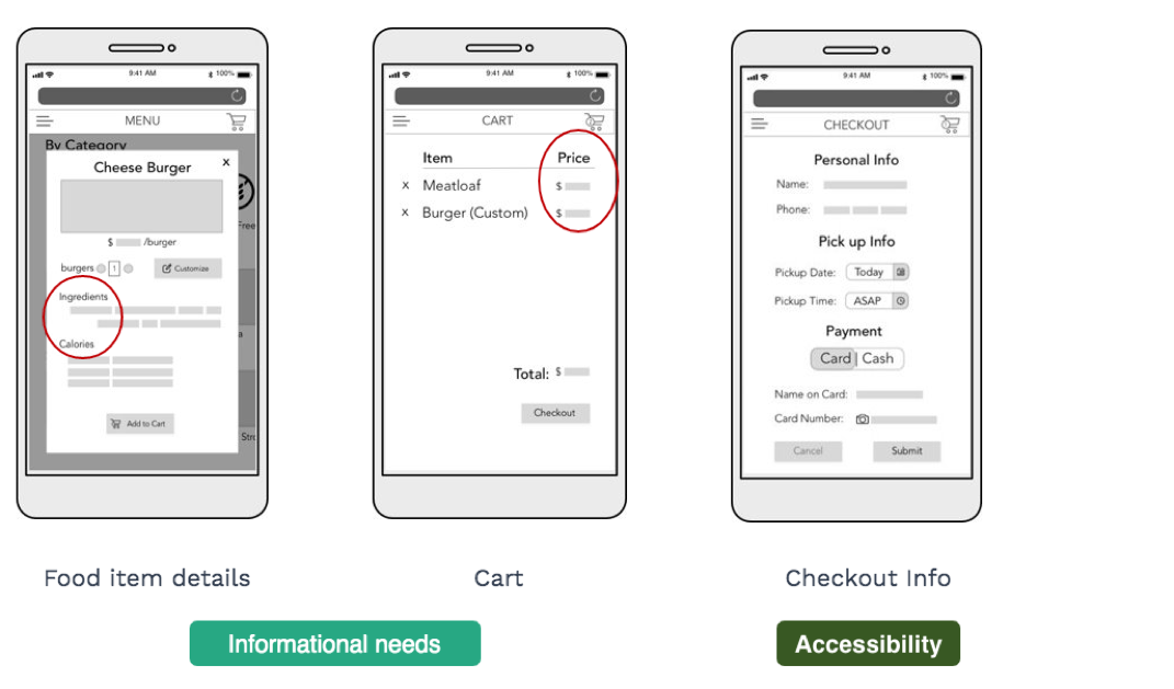
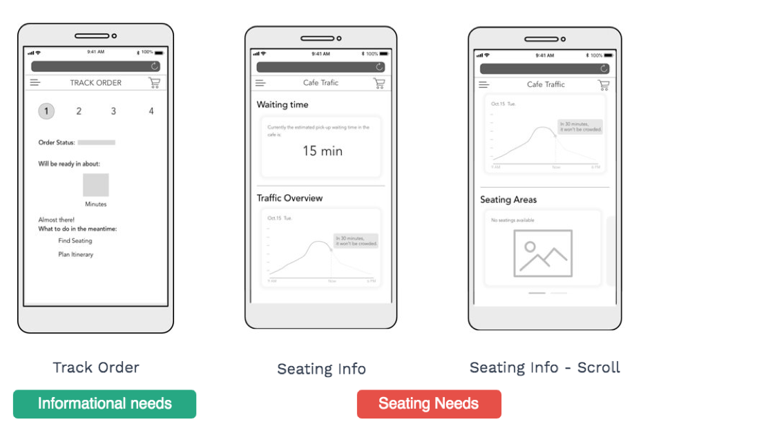
Among them, the information needs, traffic flow, and seating needs are the most common customer demands and are pain points caused by the current service design of the cafe.
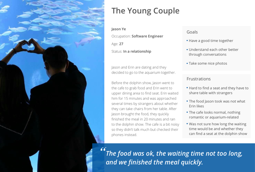
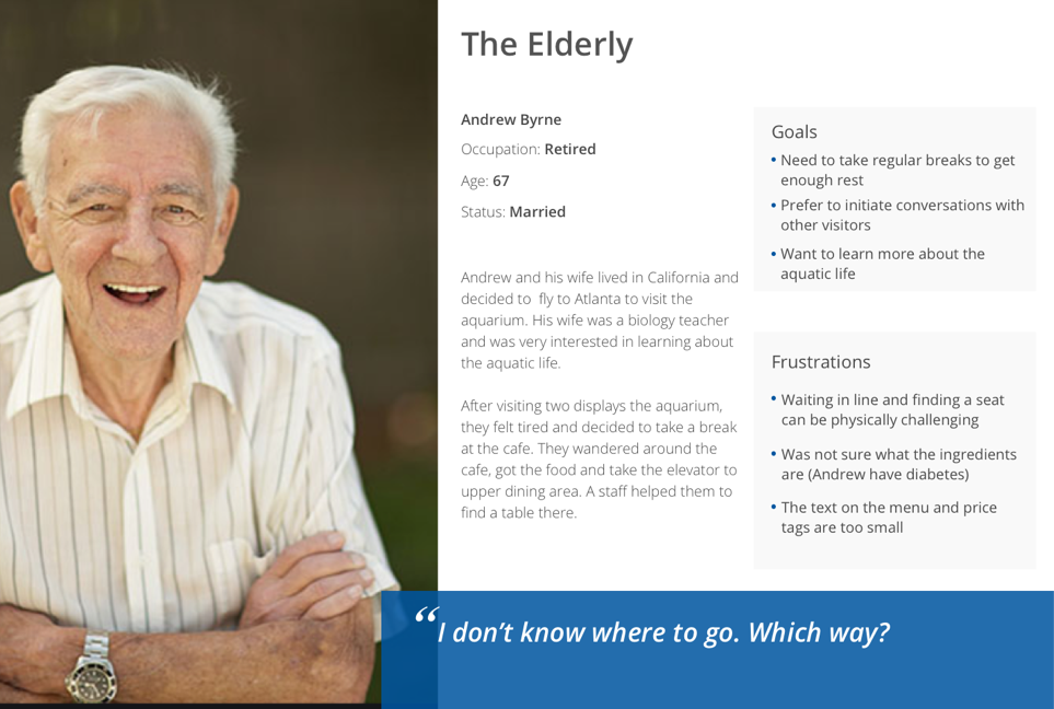
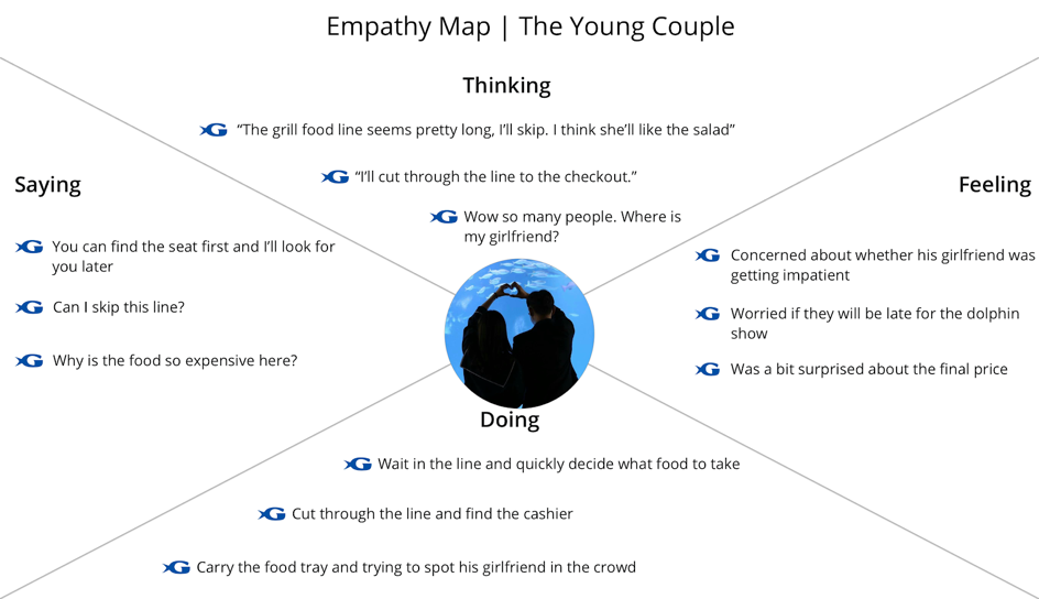
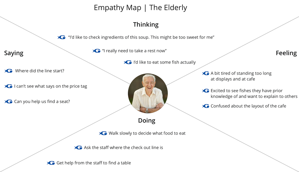
In order to account for all the customers, we identified the top three most common user profiles from our observations and organized them into personas and empathy maps. We then created user journeys based on those profiles which outlined the touchpoints, emotions and design opportunities for each type of user.
We decided to use families as the primary user group because they are 70% of the total aquarium visitors.
Up to this point, our team has defined the overall problem space and conducted customer research through various methods to gather insights into the cafe's operations as well as understanding the customers at a deeper level. The problems of the cafe can be grouped into five categories:
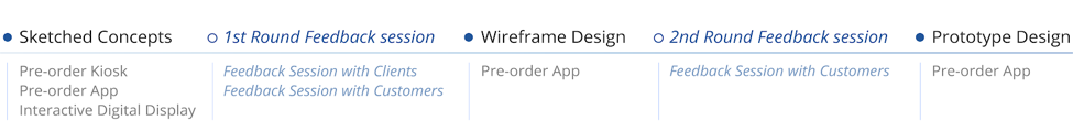
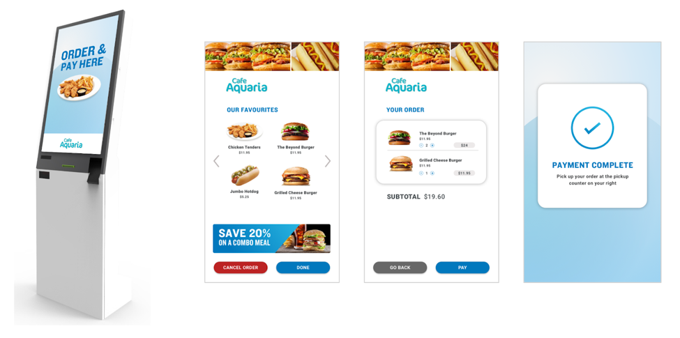
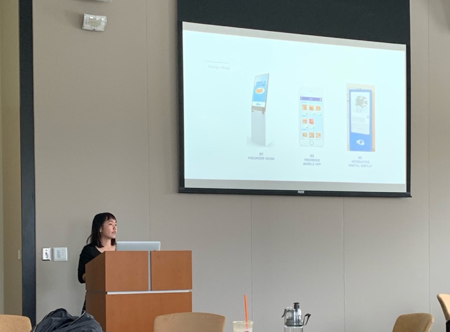
Self-ordering kiosks allow customers to order food themselves, and serve as an additional sales channel to the existing check out system. They can increase customer throughput during peak traffic hours, and increase sales by offering visitors another way to pay for their purchases at the cafe. The kiosks give information to customers about what is available without having to enter the cafe, so they can make better informed decisions, faster.
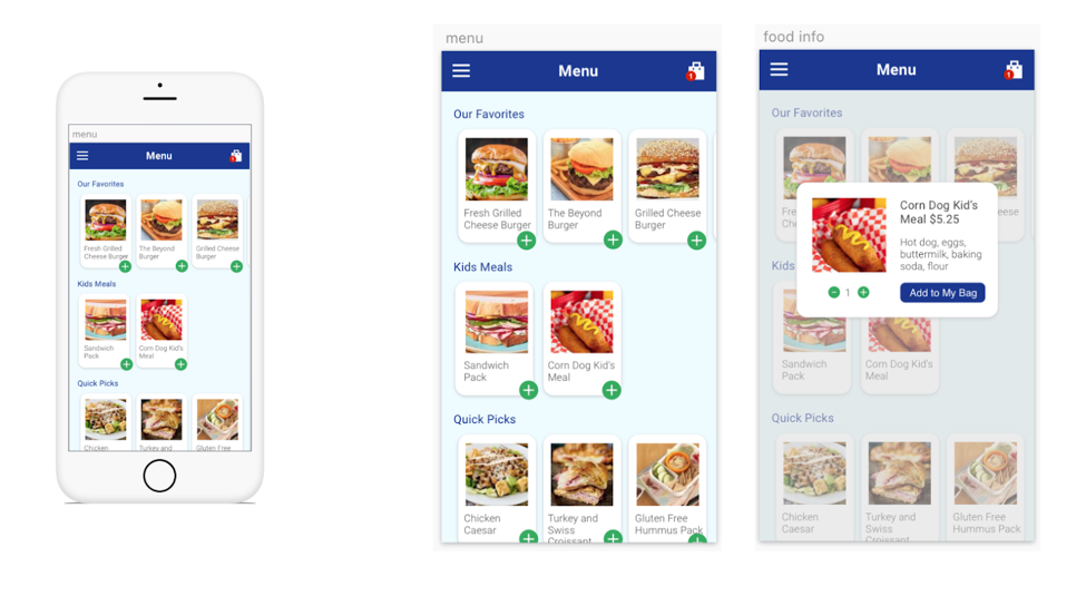
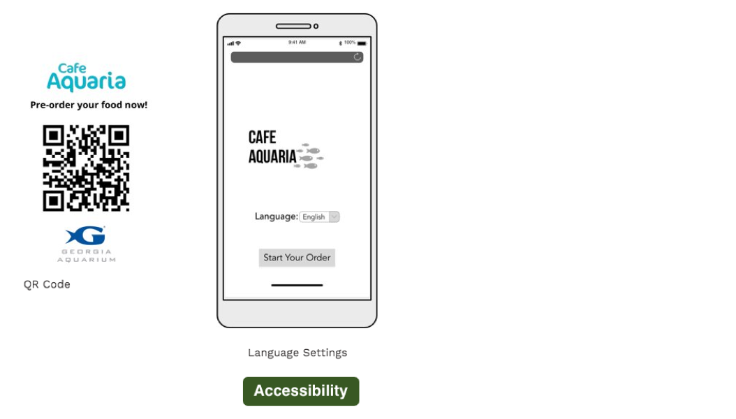
Our second concept explores the pre-order system in a different format - a pre-order mobile application. As the application will largely be used only once, we are also considering the option of implementing a website that can be accessed by scanning a QR code or going to a link on the internet.
Besides the digital solutions, we also brainstormed on potential changes in physical layout and service.
Participants were recruited from a pool of Georgia Tech students and interviewed through a semi-structured interview format. A trial interview helped us resequence the feedback session, including the format of the slide deck presented and the question design.
The sequence of the feedback session was as follows:
1. Background on project: Outline the current customer experience at the cafe + State the goal of the project
2. Present all solutions
3. Conduct feedback session based on questionnaire
4. Ask follow-up questions for other comments and suggestions
5. Closing remarks and thanks
Overall, the ideas are ranked as follows: mobile app > kiosk > interactive digital display. Thus, we decided to focus on the pre-ordering mobile app design.
1. Make the app discoverable and accessible
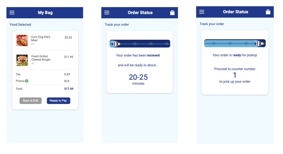
After we decided on the mobile app idea, we used the wireframes above to create a low fidelity interactive prototype on Sketch to get users' feedback on functions and layout.
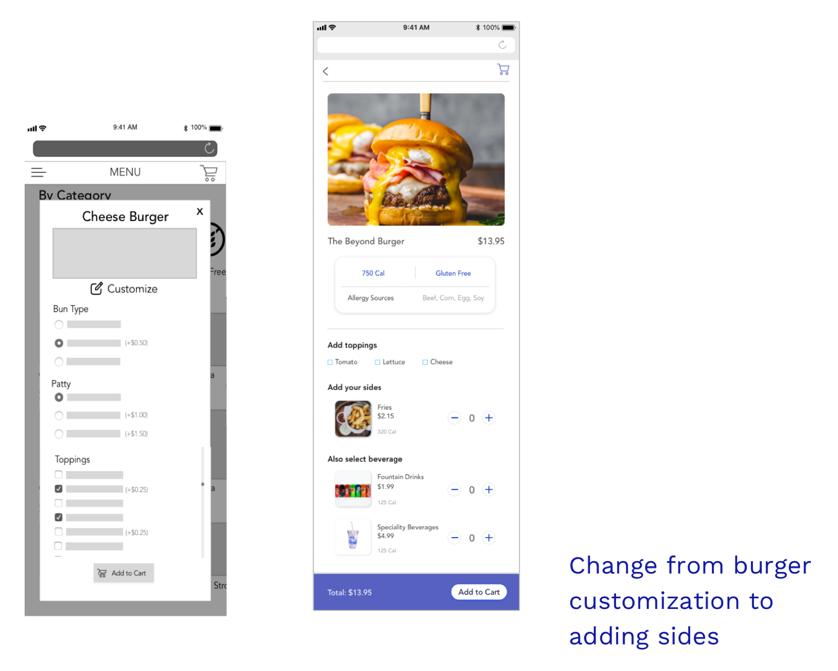
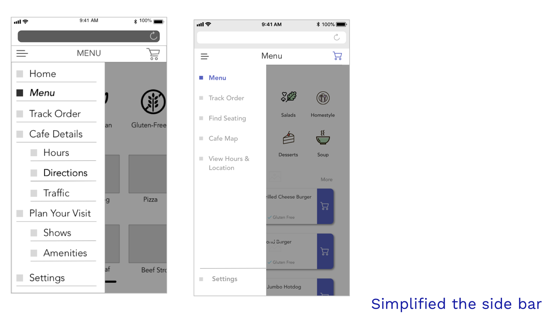
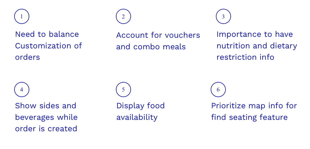
After that, we had two iteractions of evaluation and redesign to create the prototype (shown as a video in intro). There are 3 changes I'd like to highlight below:
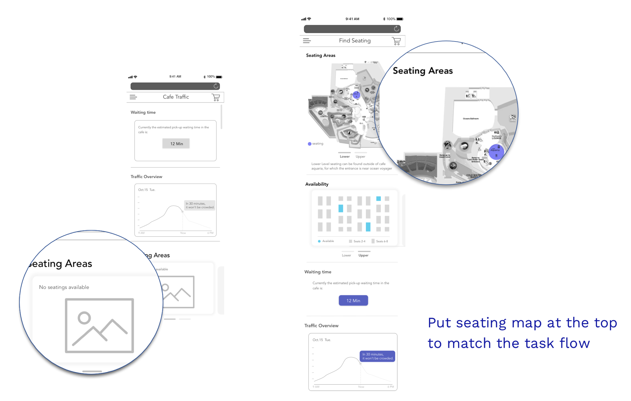
After we developed the first draft of high-fidelity prototype, we had an 1-hour expert review with the cafe manager, operations staff and aquarium customer experience director. This method had four goals:
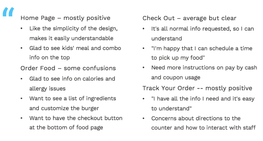
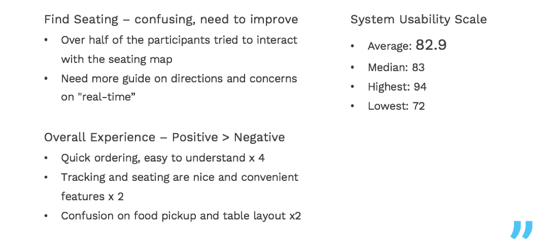
We presented our findings to our clients and our professor. They love the efforts we put into research and consider our pre-ordering mobile app to be a feasible and resonable solution.
They collected all our reports and design files, telling us that they are likely to implement this app in late 2020.
1. During the exploratory research stage, because all our methods are qualitative and we used convenient sampling, the results could be biased.
Therefore, after getting the qualitative data, I'd like to design a survey to gather data from a large sample size in order to prioritize pain points based on how many people are influenced by the problems.
2. During our ideation stage, we could host a participatory design workshop that invites both aquarium staff and visitors to participate. Through designing with our users and stakeholders, we could explore designs from various perspectives and understand what they value based on their actions.
3. During the evaluative research stage, because our time was running out, we did guerilla usability testing. I would love to do a full-scale usability testing that recruit people from the 3 major user groups we identified and also test if they can notice and scan the QR code to create the order.
By doing so, we could be sure that our design meets the need of most of the users and that there's no discoverability issue of the QR code.